This is a guest post from Sophie DeBenedetto, co-author of Programming Phoenix LiveView. You can get started with your own Elixir Phoenix application in a jiffy!
You may already be reaching for LiveView components to wrap up the behavior and markup of distinct portions of your LiveView UI.
In this post, we’re going to take a single-purpose component that displays book review data in Bootstrap-style card format, and transform it into a highly-reusable component that you can use throughout your application, using LiveView component slots.
We’ll start with a simple component that uses the default slot, then we’ll use named slots and teach our component to yield variables back up to the caller. Finally, we’ll use iteration and named slots to dynamically render nested function components.
The Goal
We want to be able to dynamically render content within the markup of a Bootstrap card. When we’re done, we’ll have a set of nested function components that iterates over a list of items, and uses named slots to render a card for each one. Our function components will be generic and reusable—they won’t have awareness of what content they’re rendering, so you’ll be able to use them again and again throughout your app to display Bootstrap cards.
The Feature: Display Book Reviews
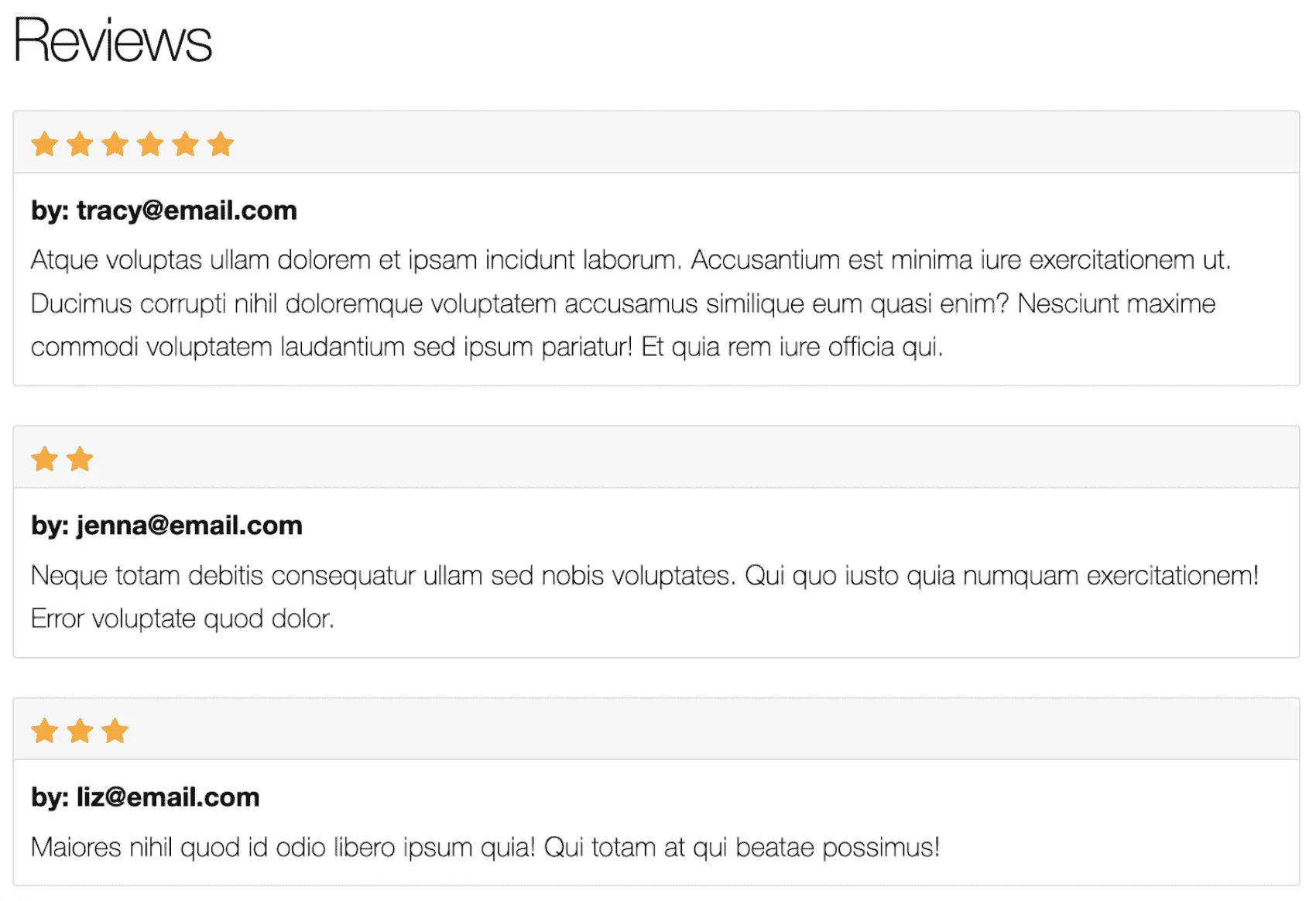
In this post, we’ll build a Bootstrap-style card component and use it to render a set of book reviews like this:

We’ll use our reusable card component to render each book review’s details, including the number of stars, the email of the user who left the review, and the details of the review.
We’ll start with a simple component that iterates over the list of a book’s reviews and renders each one in a card. Let’s begin.
The Simple Card Component
First up, we’ll define a module that implements a cards/1 function component to iterate over book reviews and display each one in a Bootstrap card.
defmodule LiveLibrary.CardComponent do
  use Phoenix.Component

  def cards(assigns) do
    ~H"""
    <%= for review <- @reviews do %>
      <div class="card review-card">
        <div class="card-header">
          <%= for _ <- 0..review.stars do %>
            <i class="bi bi-star-fill"></i>
          <% end %>
        </div>
        <div class="card-body">
          <h5 class="card-title">
            <strong>by: <%= review.user.email %></strong>
          </h5>
          <p class="card-text">
            <%= review.notes %>
          </p>
        </div>
      </div>
    <% end %>
    """
  end

end
Our function component is simple enough—it expects the provided assigns to include a @reviews assignment. It iterates over those reviews and renders a Bootstrap card to display the details of each one. Now, we can call on our function component from another template like this:
<CardComponent.cards reviews={@book.reviews} />
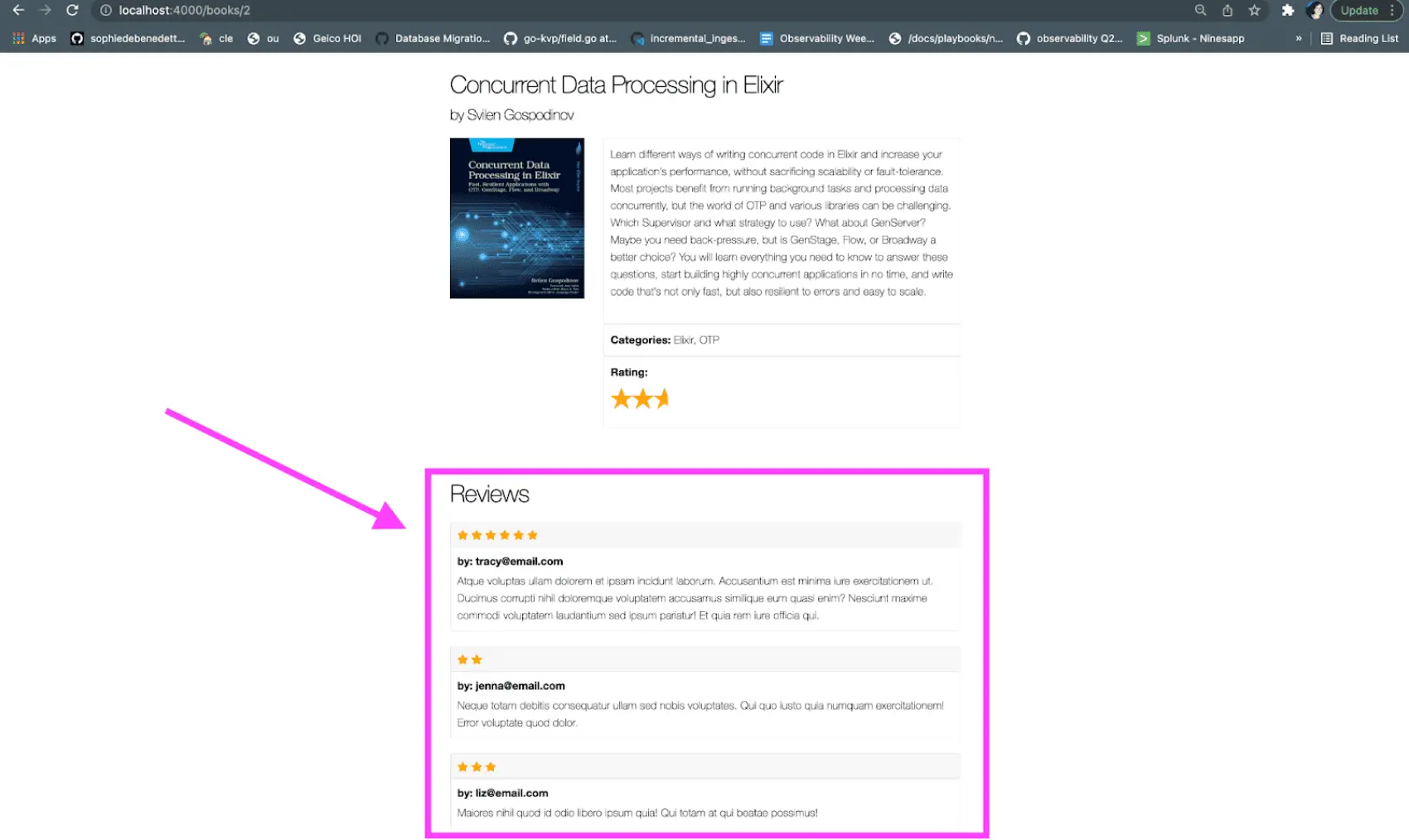
And the browser should display the following:

Our simple function component is a clean way for us to encapsulate the markup used for rendering a book review.
This may be perfect for our needs. But we can make our Bootstrap card more reusable. Right now the CardComponent.cards/1 function component contains markup for rendering content in a card, but that content is hard-coded to display book review details. We can imagine reusing this card markup elsewhere in our app to display different types of content. Let’s refactor our component to make it a little more reusable.
Dynamic Components with the Default Slot
We’ll start by taking advantage of a component feature called “slots”. Slots allow us to provide our component with blocks of HTML to render via a simple syntax:
<CardComponent.cards reviews={@book.reviews} >
<!-- some content -->
</CardComponent.cards >
First, we’ll take a look at how we want to be able to call our function component, then we’ll build out that functionality with slots.
We want our card component to only be responsible for rendering card markup—it shouldn’t know anything about the content it’s rendering within that markup. In other words, it shouldn’t need awareness that the content we’re rendering describes a book review.
As an intermediate step, we’ll start with a simplified version of our function component that only renders the card header:
def cards(assigns) do
  ~H"""
  <%= for review <- @reviews do %>
    <div class="card review-card">
      <div class="card-header">
        <%= for _ <- 0..review.stars do %>
          <i class="bi bi-star-fill"></i>
        <% end %>
      </div>
    </div>
  <% end %>
  """
end
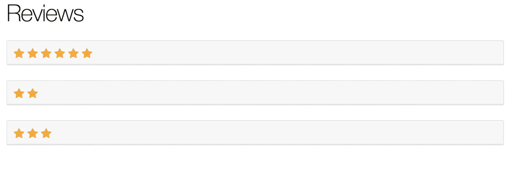
Now, if we check out our component in the browser, we should see this:

Next up, we’ll make the cards/1 function component a little less smart. We’ll refactor the @reviews assignment to an @items one and we’ll use the default slot to dynamically render content into the card header:
def cards(assigns) do
  ~H"""
  <%= for item <- @items do %>
    <div class="card review-card">
      <div class="card-header">
        <%= render_slot(@inner_block, item)
      </div>
    </div>
  <%% end %>
  """
end
We’ll break down how this works in a bit. First, let’s take a look at how we’ll render this component:
<CardComponent.cards let={review} items={@book.reviews} >
  <%= for _ <- 0..review.stars do %>
    <i class="bi bi-star-fill"></i>
  <% end %>
</CardComponent.cards >
In between the opening and closing component tags, we’re telling the component to render a Bootstrap star icon for each of the stars in a given review. This content is made available to the component as the @inner_block assigns, and the component renders it by invoking render_slot/2 with a first argument of @inner_block. Let’s take a closer look at the second argument that we’re passing to render_slot/2 now.
We’re able to refer to the review variable in the content between our component tags because we’re telling the function component to yield a variable back up to the caller by passing a second argument to render_slot/2. So, in the function component, we’re iterating through the list of items in the @items assigns. Then, when we call render_slot/2, we pass it a second argument of an individual item. This passes the value of the item variable back up to the caller and sets it equal to a variable, review, that we specified in the let assignment of our opening component tag.
With this, we’re left with a highly dynamic function component that wraps up some card markup and leaves the awareness of the content to render in that markup entirely up to the caller.
Our usage of the default slot that can render the @inner_block assignment is a little limiting though. We can only render one segment of content as the @inner_block, and we need to inject not only card header content, but also the card title and body content. We can do exactly that with the help of named slots.
Extending The Component With Named Slots
We’ll implement a named slot for each of the sections of the card component we need to inject content into. Let’s begin once again by writing out how we want to be able to call our updated component:
<CardComponent.cards items={@book.reviews} >
  <:header let={review}>
    <%= for _ <- 0..review.stars do %>
      <i class="bi bi-star-fill"></i>
    <% end %>
  </:header>

  <:title let={review}>
    by: <%= review.user.email %>
  </:title>

  <:body let={review}>
    <%= review.notes %>
  </:body>
</CardComponent.cards >
Here, we’re using an opening and closing <:header>, <:title>, and <:body> tag placing some content to render in between those tags. This content will be made available in the component as the @header, @title, and @body assignment respectively. We’ve also moved the let={review} variable assignment to each individual slot tag. Now, let’s update our component to render the header, title, and body content now.
def cards(assigns) do
~H"""
 <%= for item <- @items do %>
   <div class="card review-card">
     <div class="card-header">
       <%= render_slot(@header, item) %>
     </div>
     <div class="card-body">
       <h5 class="card-title">
         <strong><%= render_slot(@title, item) %></strong>
       </h5>
       <p class="card-text">
         <%= render_slot(@body, item) %>
       </p>
     </div>
   </div>
 <% end %>
"""
end
We use render_slot/2 to render each piece of dynamic content, and we pass the value of the item variable, which evaluates to an individual review struct, back up to the caller where it is made available as the review variable thanks to our usage of let. Now, if we go back to the browser, we’ll see all of the review details rendered in an individual card:

With that, we’ve built a reusable cards/1 component that can render a list of cards. But what about if we only want to render a single card? We can refactor our component module to implement a new function component, card/1. Then, we’ll update the cards/1 function component to iterate over the list of items in the assigns and render a card component for each one. Let’s do it.
Iteratively Render Nested Function Components
First up, we’ll define a card/1 function component like this:
def card(assigns) do
  ~H"""
  <div class="card review-card">
    <div class="card-header">
      <%= render_slot(@header, @item) %>
    </div>
    <div class="card-body">
      <h5 class="card-title">
        <strong><%= render_slot(@title, @item) %></strong>
      </h5>
      <p class="card-text">
        <%= render_slot(@body, @item) %>
      </p>
    </div>
  </div>
  """
end
Our new function component is simple enough—all we did was move the markup that represents an individual card into its own component. This component also assumes that it will receive an assigns that contains a @item, @header, @title, and @body assignment. Next up, let’s refactor the cards/1 component to iteratively render a card for each item:
def cards(assigns) do
  ~H"""
  <%= for item <- @items do %>
    <.card header={@header} title={@title} body={@body} item={item} />
  <% end %>
  """
end
Here, we start our iteration in the for loop. Then, we call the card/1 function component for each item, passing through the @header, @title, and @body assignment. The manner in which we call cards/1 doesn’t change. It still looks like this:
<CardComponent.cards items={@reviews}>
  <:header let={review}>
    <%= for _ <- 0..review.stars do %>
      <i class="bi bi-star-fill"></i>
    <% end %>
  </:header>

  <:title let={review}>
    by: <%= review.user.email %>
  </:title>

  <:body let={review}>
    <%= review.notes %>
  </:body>
</CardComponent.cards>
So, the cards/1 function uses the :header, :title, and :body named slots and its assigns contains the @header, @title, and @body assignments. Then, it simply passes those assignments through to the card/1 component, which uses render_slot/1 to render the content in the original caller’s named slots.
Putting it all together, we end up with a highly dynamic and reusable function component that can render many different types of content into a list of Bootstrap cards. The cards/1 function component wraps up all of the card markup without having any awareness of what content will be rendered into that markup. We leave it entirely up to the caller to specify what content will be rendered within the card’s header, title, and body.
Fly ❤️ Elixir
Fly is an awesome place to run your Elixir apps. It’s really easy to get started. You can be running in minutes.
Deploy your Elixir app today! →
Wrap Up
In our example, we began with a single-purpose Bootstrap card LiveView component, and converted it into a versatile function component with the help of component slots. We used more advanced techniques like named slots and yielding variables up to the function component caller to make the function component even more sophisticated and dynamic. And, we used named slots and nested function components to iteratively render a list of components. You’re ready to go out and build some reusable function components of your own.
